
Did you know that simply using the right colors can make a small room feel much larger? Conversely, the wrong color choices can make even a spacious room feel cramped and uncomfortable.
In interior design, color is not just about aesthetics — it is a science. The right application of color can visually enlarge your space, calm your mind, and give the entire environment a premium feel.
In this article, I will walk you through five popular color themes and the psychological effects different colors have on the human mind and body. This is information you will rarely find gathered in one place.
Three Smart Color Strategies for Small Rooms
1. Color Tone — Light or Dark?
For small rooms, always choose neutral or light colors. Light colors reflect light, keeping the room bright and airy. Great options include off-white, beige, gray, pastels, soft pink, mint green, or light blue.
Dark colors absorb light — making the room feel even smaller and heavier. Dark colors in a small room will only create a more cramped look.
2. Paint Finish — Matt or Glossy?
In Bangladesh, two types of finishes are widely available — matt and glossy. Never use matt finish in a small room. Matt paint absorbs light, making the space darker and more confined.
For small rooms, always go with a glossy finish. It reflects light and makes the room look brighter and larger. Matt finish has its own charm — but it is simply not suited for small spaces.
3. Seamless Look — No Partitions
Do not create color partitions on your walls — meaning, avoid having one color on one wall and a different color on another.
When our eyes detect a color change on a wall, the brain automatically measures the boundary of the room — making it feel smaller. Keep all walls in the same color tone.
If you feel an all-same-color look will be boring, use a slightly darker or lighter shade of your main color on one accent wall. This adds depth without visual fragmentation.
Five Popular Interior Color Themes
Now let us explore the five most popular color themes in interior design. For each theme, I will explain which colors to use, where to use them, and how to apply them effectively.
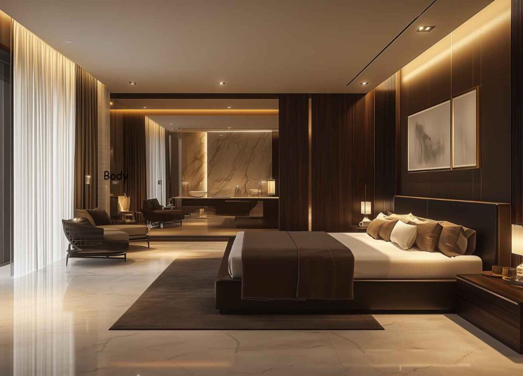
Theme 1: Luxury
The biggest constraint in any rental flat is the position of electrical points. You may want beautiful bedside lights, but there’s no outlet nearby. Running new wiring means cutting channels into the walls — something most landlords refuse to allow.
Rechargeable wireless wall sconces solve this completely. They attach with adhesive or magnetic mounts — no screws, no drilling, no damage. When you move, you peel them off the wall and pack them in your bag.
How to use them well: In your living room, place a sconce directly above a favourite painting or a family photo wall. This is called accent lighting — it adds drama and depth to an otherwise flat wall. In your bedroom, mount two sconces on either side of a dressing mirror; they eliminate shadows and create perfect light for makeup or grooming.
In design language, luxury means tranquility and spaciousness. The more open and calm your room feels, the more premium and luxurious it appears.
Wall Color: Choose any neutral — beige, off-white, or light gray. These colors have a high LRV (Light Reflectance Value), meaning they bounce light beautifully around the room. Even a smaller space feels grand and luxurious. Personally, beige is my top choice for this theme.
Furniture: Use wood texture or natural finish for wardrobes and beds. Natural wood tones create a sense of permanence and elegance. Pairing a neutral wall with slightly darker wooden furniture adds depth and prevents the room from looking flat.
Small Details: Use golden accents for door handles, drawer knobs, or light fittings. Our brain instinctively associates gold with value and prestige. This one small touch instantly elevates an ordinary room into a premium space.
Quick Summary: Walls: Neutral (Beige / Off-White) | Furniture: Natural Wood | Fittings: Golden
Theme 2: Modern
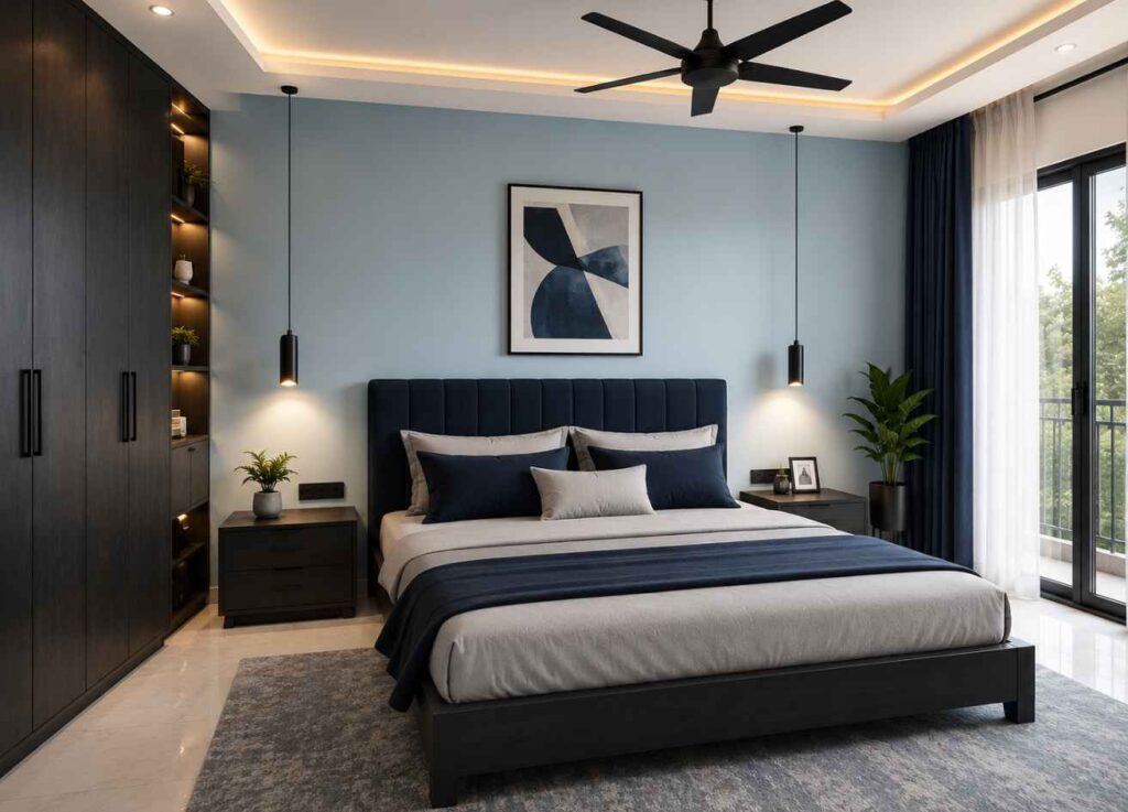
Modern design means making a room look clean, fresh, and polished. The core goal is to remove visual clutter and bring a sense of calm clarity.
Wall Color: Choose pastel colors — soft, desaturated versions of any vibrant color. Think of any color mixed with white. Examples: light blue, soft green, or muted yellow. These low-saturation colors put very little strain on your eyes and make the room feel open.
Furniture — Contrast: If everything is too light, the room can feel washed out. Choose furniture or curtains in a noticeably darker tone. For example, pair light blue walls with navy or charcoal gray. Or light green walls with forest green or dark brown.
Small Details: Use black for fans, light frames, or drawer handles. In modern design, black acts as an anchor — giving the room a sharp, smart, and contemporary edge.
Quick Summary: Walls: Pastel | Furniture: Darker Contrast Color | Fittings: Black
Theme 3: Minimalist
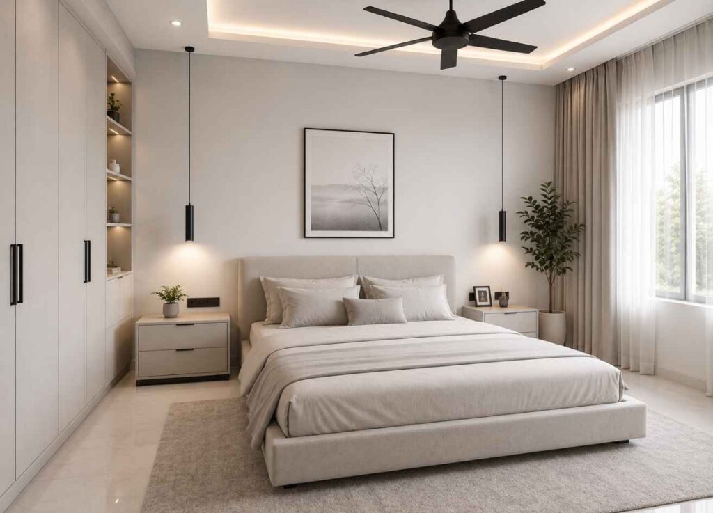
Minimalist design means more with less. Its core purpose is to keep your room calm and reduce mental load. In scientific terms, a simple, uncluttered environment reduces cognitive load — the mental effort your brain expends just by being in a space.
Wall Color: Choose very light and neutral shades — off-white, light gray, or the palest hint of blue. Make sure the color is not too bright or intense.
Furniture: Use the same color as your wall, but two or three shades darker or lighter for your furniture. Using a completely different color breaks the minimalist vibe entirely. Tonal variations of the same color create a smooth, calm, and layered feel.
Small Details: Use black, silver, or brown for small fittings and decor. Minimalist does not mean empty — it simply means a space free from unnecessary color noise.
Quick Summary: Walls: Light Neutral | Furniture: Same Color, Different Shade | Fittings: Black / Silver / Brown
Theme 4: Contemporary
Contemporary design is for those who love bold choices and enjoy expressing their personality through color. It blends current trends with personal taste.
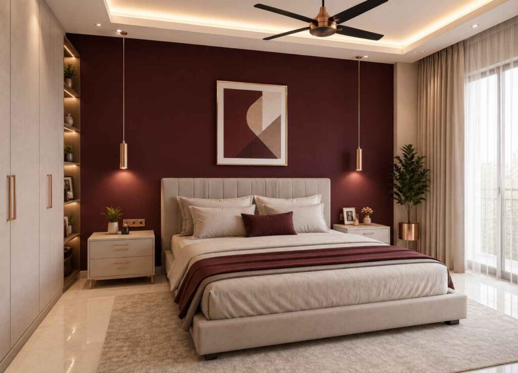
Wall Color: Apply a vibrant or pop color to just one feature wall — not every wall. This creates a focal point the moment someone enters the room, instantly energizing the space. I recommend going slightly darker — for example, instead of bright red, try a deeper maroon. Keep the remaining walls neutral or pastel.
Furniture: Since one wall is bold, keep your furniture calm and neutral. The contrast between the strong wall and the muted furniture creates sophisticated visual balance.
Small Details: Rose gold or silver finishes are extremely popular right now. These add a layer of modern luxury alongside the contemporary boldness.
Quick Summary: Walls: One Bold Accent + Rest Neutral | Furniture: Neutral | Fittings: Rose Gold / Silver
Theme 5: Classic
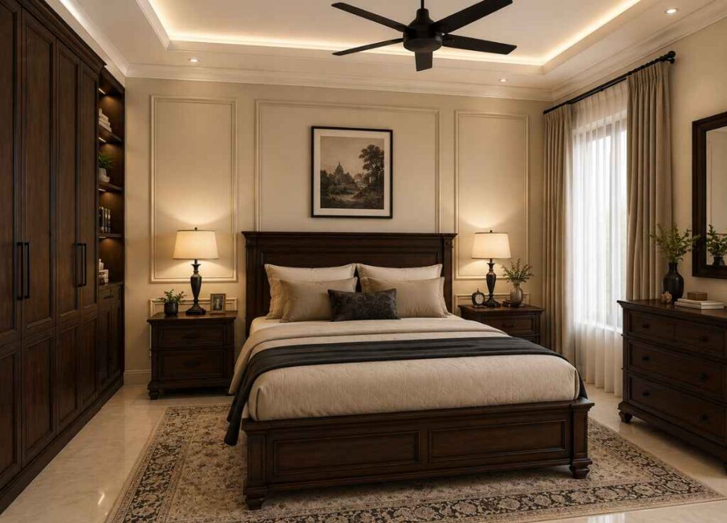
Classic design is for those who want a timeless, refined, and dignified look. It is a beautiful blend of elegance and tradition.
Wall Color: Choose any neutral — beige or very light gray. Beige is particularly close to earth tones, which naturally bring a sense of peace to the mind.
Furniture: Use dark wood shades — dark chocolate or mahogany finish. Against a light wall, darker wooden pieces create a powerful, regal atmosphere. They symbolize permanence and sophistication.
Small Details: Use black for highlights and small fittings. Between the light walls and the wooden furniture, black acts as a visual border that prevents the room from looking pale. It gives the design a crisp, finished quality.
The secret of classic design is balance: the lightest element is the wall, furniture is in dark natural wood, and small details carry a touch of black.
Quick Summary: Walls: Beige / Light Gray | Furniture: Dark Wood | Fittings: Black
The Psychological Impact of Color on the Human Mind & Body
Before choosing a color theme for your home, there is one more critical thing to understand: the effect different colors have on your mind and body. This is backed by science.
Blue — The Color of Calm and Trust
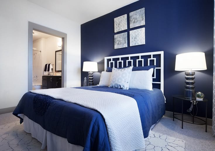
Blue is known as the Calming Color. It brings peace to the mind and reduces anxiety. Research has shown that blue activates the parasympathetic nervous system, causing heart rate to slow and breathing to become more relaxed. When you see blue, your body naturally begins to calm itself.
- Best use: Bedroom — because it helps the brain unwind and promotes better sleep.
Green — The Color of Balance and Healing
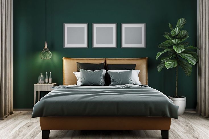
Green is the color of nature and the most comfortable color for our eyes. It removes fatigue and restores motivation. Science calls this the Biophilia Hypothesis — humans instinctively feel safe in green environments. The eye’s lens requires the least effort to focus on green, reducing visual fatigue.
- Best use: Reading room or living room — significantly reduces eye strain during long hours.
Yellow — The Color of Joy and Creativity
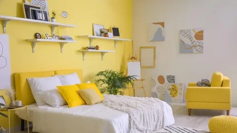
Yellow is called the Energy Booster. It makes people feel optimistic and sharpens creative thinking. Research shows that bright yellow stimulates the release of serotonin in the brain — improving mood and overall energy. However, too much deep yellow over a long time can cause irritation. Use it as a highlight — no more than 10% of the total design.
- Best use: Kitchen, home office, or any creative space — as an accent element.
Red — The Color of Energy and Appetite
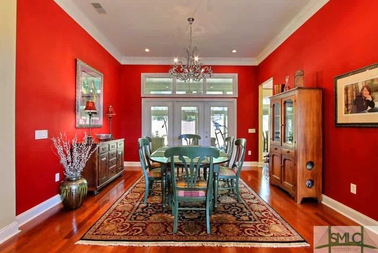
Red is an extremely powerful and stimulating color. It builds confidence and commands attention. Research shows that red increases adrenaline levels in the body, which raises blood pressure and stimulates appetite. This is why the world’s most successful restaurant brands consistently use red in their interiors.
- Best use: Restaurant or dining room — increases appetite and creates a lively, social atmosphere.
Before You Buy Paint — Always Do a Sample Test
Most people go to a paint store, browse a catalog, choose a color, and buy it — only to realize at home that it looks completely different on their walls. This is one of the most common and avoidable mistakes in home renovation.
To avoid this, buy small sample pots of 2 to 3 shades and apply each one to a 1 ft x 1 ft section of your wall. Then observe how the color looks in both daylight and under artificial night lighting. Colors behave very differently depending on the light source. Only after observing both conditions should you make your final decision.
Final Thoughts
Color is not just something painted on a wall. It determines the atmosphere of your home, the state of your mind, and the daily emotional experience of everyone who lives there.
When used with knowledge and intention, the right color in the right place can make your home not only beautiful — but livable, calming, and deeply inspiring.
If you need professional guidance to choose the perfect color palette and interior design for your home, office, restaurant, or showroom — we are here to help.